News and Updates
Growth, Change, and Slab Serifs: BrainPOP’s New Logo
When we started BrainPOP in 1999, the world was a very different place. “Edtech” meant calculators and overhead projectors. If you watched a movie in the classroom, it was probably on a VHS tape or maybe a film reel.
In 1999, we also created our first logo, which looks like this:
We love this logo for a lot of reasons: it reflects our playful approach to learning, is easy to read, and stands out in what has become a sea of competitors.
It’s not without its limitations.
Is our company spelled BrainPOP or Brain POP? (It’s BrainPOP, please!) Can we put it against a dark background? (Let’s not.) Is there a horizontal version? (There sure isn’t!) And what in the world is that blue thing? (It’s a lens, but not even my mom knows that.)
But a lot can change in 20 years. Education itself has come a long way, and we’ve evolved along with it. It’s time for a new logo that reflects the company we’ve become, and can stand up for our vision of the future.
What Is BrainPOP in 2020?
In two short decades we’ve grown from a small but effective passion project into a global company, dedicated to making knowledge accessible for all kinds of curious learners. Updating our logo demanded we reflect that growth. So what are some key traits that make up BrainPOP’s identity today? Our brand and leadership teams got together and decided on some must-haves for the mark people will see when they meet us.
Nerdy and Quirky
BrainPOP was born from an unabashed love of learning and a knack for playful candor. We’re not afraid to be fun or even odd when the situation calls for it.
Respectful
We speak to children—not at them—and have earned the trust of a generation of teachers and families because of it. We’re deeply grateful and take that responsibility seriously.
Unobtrusive
Our characters, creativity tools, and the kids who love learning and growing with us are the real stars of BrainPOP. Our brand can hang back a little.
We wanted something both studious and unexpected. A logo that’s fun without being condescending. A look that calls back to the trust we’ve earned, while laying the foundation to build for the future. We’re proud to share our new logo, a symbol of how far we’ve come, and a sign of where we’re headed.
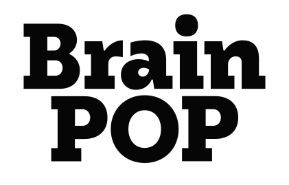
Get to Know BrainPOP’s New Look
As with everything we do, we tweaked and iterated every inch of this thing. Working with brand identity designer Josh Carnley, we pinched letterforms and pulled slabs, playing with every corner of this already custom typeface until it told exactly the story we wanted to tell.
The slab serifs are an ode to our former logo, calling back to BrainPOP’s place in edtech, but with a modern twist. The slabs also give a sense of stability and credibility, but we played around with each character’s placement and weight, squeezing here and shaping there to keep it dynamic, fun, and a little weird.
This juxtaposition of playful and serious (why are contradictions so powerful?) was a guiding principle throughout our process. Striking this balance between joy and rigor is who we are, and key in our approach to learning. We’re proud to have a logo that embodies that.
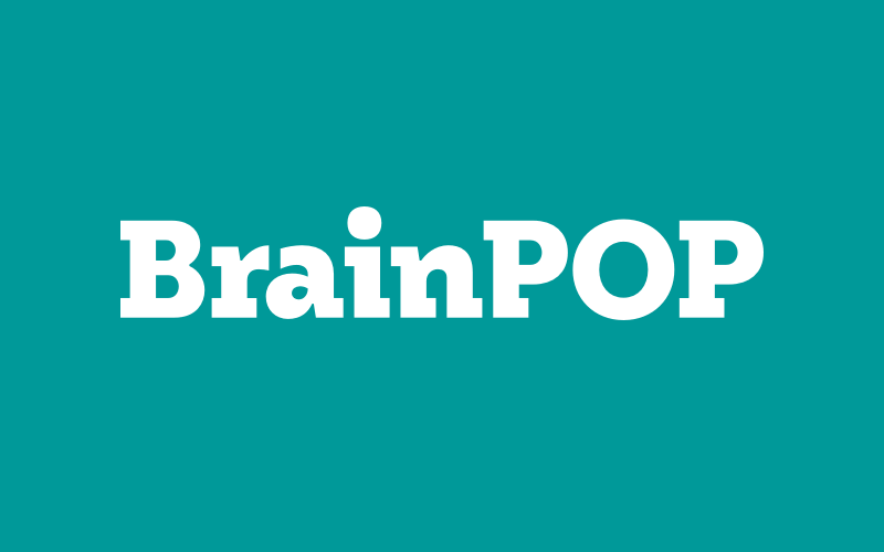
And our product design team is thrilled, because it adapts to page colors, and even has a horizontal mode! We’re really liking the way it looks on our pages. Brightens the place up.
Thanks for reading! Keep an eye out as we unveil this new logo across all our sites and channels this month. And as the world continues to change and BrainPOP continues to grow with it, we hope you’ll stick around for the fun!